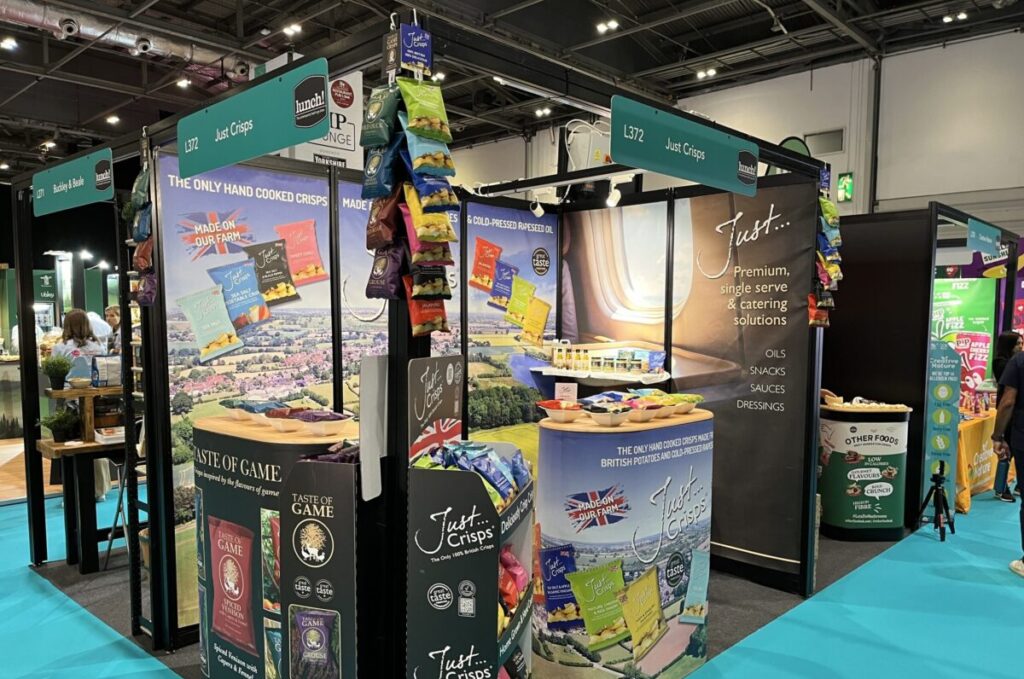
THE SCIENCE OF THE "STOP". HOW TO DESIGN EXHIBITION GRAPHICS THAT HALT FOOT TRAFFIC
You have roughly three seconds.
That is the tiny window of time your brand has to capture a visitor’s attention as they walk down a crowded exhibition aisle. In those three seconds, their brain decides whether to keep walking or to “stop and shop.”
At Evolve, we know that high-quality printing is only half the battle; the real magic happens in the design strategy. If you want to stand out in a sea of competitors, you need to move beyond “pretty pictures” and embrace the science of visual psychology.
Here is how you can design graphics that effectively halt foot traffic.

1. The Power of “Negative Space”
One of the biggest mistakes exhibitors make is trying to fill every square inch of their graphics with information. In a busy hall, a cluttered graphic is just noise—and the brain is programmed to filter out noise.
· Less is More: Negative space (the empty area around your text and images) isn’t “wasted” space. It is a tool that guides the eye toward what actually matters.
· Create a Focal Point: Give your primary message room to breathe. By surrounding your headline or key product image with empty space, you make it pop.
Pro Tip: Aim for a ratio of 40% empty space to 60% content. This ensures your booth looks professional and approachable, rather than overwhelming.
2. Use High-Contrast Colour Palettes
Visibility starts with contrast. If your text colour is too similar to your background colour, it will “vibrate” or disappear when viewed from a distance.
· Distance Viewing: Remember that people will see your stand from 10, 20, or even 50 feet away. High contrast (like dark blue on white or yellow on black) ensures your message is legible before they even reach your booth.
· The 60-30-10 Rule: Use a primary brand colour for 60% of the design, a secondary colour for 30%, and a bold “accent” colour for the final 10% (usually for your Call to Action).
3. Mastering the “Rule of Three”
When a visitor stops at your stand, they shouldn’t have to think. Use the “Rule of Three” to structure your messaging into three distinct, digestible parts:
1. The Headline: Who are you? (Keep it short).
2. The Benefit: What do you do for them? (Focus on the solution, not the features).
3. The Call to Action (CTA):
What should they do next? (e.g., “Scan here,” “Ask for a demo,” or “Try it now”).
By limiting your core message to these three pillars, you ensure that the visitor absorbs your value proposition instantly.
4. Typography: Size and Hierarchy Matter
If your font is too small or too “fussy,” people won’t work to read it.
· Hierarchy: Your main headline should be the largest, followed by subheadings, then body text.
· Sans-Serif is King: For large-format graphics, sans-serif fonts (like Helvetica, Arial, or Montserrat) are generally much easier to read from a distance than ornate, serif fonts.
· Eye Level: Keep your most important information at eye level (roughly 1.5m to 1.7m from the floor). Avoid placing key text near the bottom of your panels, where it will likely be obscured by furniture or passing crowds.
5. Clear Sightlines, Constant Engagement
The goal of your exhibition graphics isn’t just to look good—it’s to act as a silent salesperson. When you combine the science of negative space, high-contrast colours, and a clear messaging hierarchy, you create a booth that doesn’t just sit there—it actively pulls people in.
Is your next exhibition coming up? Let Evolve help you turn these principles into high-impact reality. Contact David at the Evolve Design Team for a Graphics Consultation – david@evolvepad.co.uk.
